How to Design Everything if You Don’t Know Anything
You can start designing anything, anywhere, regardless of whether or not you’ve ever done it before. Here are 5 steps you need to get started.
If you’re here, it means you don’t think of yourself as a designer. Stop that right now.
Today, we’re going to walk through five steps so you can start your journey to designing software for other people, regardless of whether or not you’ve done it before. And these are the same principles whether you want to make something for a few people or make something that touches a billion people.
Here are the five steps you need to design if you’re not a designer:
- Delabel yourself.
- Empathize with your user.
- Illuminate the path.
- Minimize the non-essential.
- Create something great.
If you do all [of] these things, you’ll be far along on your journey to create amazing experiences. Our gift as creators today is [that] we have the chance to make something for a billion people, and here are the tools to do it.
Delabel Yourself
My first lesson for you and how to design is to delabel yourself. Don’t think of yourself as a designer or a non-designer; you’re a capable, smart, human being who’s able to learn absolutely anything. Realize that the reason why we label ourselves as a specific title, like senior backend software engineer or associate product manager, is that capitalism requires all people to be a very specific type of specialized and interchangeable washer,screw,spring or [other] part of a vast machinery. Our resumes and our college career departments want us to specialize because that’s what makes it easy for us to fit in the mold [and] to be replaced easily. The capitalist economic system does commodify people into objects of trade, of just pure economic value, but remember we’re human beings — ”I’m not a number; I’m a free man.” Know that you are a designer even if you think you aren’t.
There’s another reason why you should delabel yourself. I know a lot of you want to be CEO or the founder of a new business or startup. And if you want that, you’ve got to really know how to do all of these different things. Design is just one of [the] many different skills you need. So that is actually the first step to design for non-designers — delabel yourself.
Empathize with your user
Second, you’ve got to empathize with your user. When you’re thinking about your interactions, your website and your front-end experience, it’s a conversation that happens a thousand times per day. If you’re very successful, it happens millions — if not hundreds of millions — of times per day. For example, be polite. When you’re having a conversation with someone, make sure you wait your turn to speak and become genuinely interested in the people that are your users. See the other person’s point of view; be sympathetic; and this is where design begins. You should read the book ”How to Win Friends and Influence People” by Dale Carnegie. Don’t let the cheesy title fool you; it’s a Depression Era book that was written earnestly to try to help people get ahead in society. It’s not rocket surgery here. These are simple concepts, but the book helps you realize that we’re building something for other people. It’s about feeling their pain and their problems.

A lot of people talk about creating software like it’s an incredibly complex process, like building a car, but that’s wrong. It’s actually more like throwing a great party. When you go to a party, there’s someone to meet you at the door; they welcome you; they take your coat; [and] they say, “Hey, the bartender makes a great Manhattan, and also here’s someone I wanted you to meet.” That’s what a great experience feels like. It doesn’t matter if you’re a consumer experience, a SaaS business or an enterprise sale. All of those things basically resolve back to this idea of treating a great product or service like a party. Is it a good experience? Is it fun? Is it interesting? Do I feel welcomed? Do I understand what’s going on? Do I understand what I should be doing next?
Another empathetic skill you need to learn is to forget what you already know as the creator of a product or service. You need to run the simulation in your head of what your user is experiencing, and when you do that, you must remove all special information and knowledge you have about the product and experience, especially because you’re the one creating it and you know all about it. The absolute best product minds have the special power down path — it is one of the most interesting things I got to see firsthand working for Paul Graham at Y Combinator. He could easily simulate the experience of those who had no context and give very precise feedback about which parts of the design were going to cause problems. In design, we talk about this as sanding down the edges. The most meaningful level of empathy you could have with your user is when you can viscerally feel their needs, their pains and their confusion — only then can you fix it and improve the experience.
Picture being a part of an architectural firm that designs an airport. You’re at once the person to design the walls, the windows, the flooring and the layout of the airport — you know it intimately — but then you have to place signs to tell people where to go, and that’s hard. When you’re in a familiar space, you obviously know where everything is; the bathroom’s over there; I want to go over here. You’ve got to forget all of those things, and then and only then can you feel the confusion of a person in that space. Having a motivation (like having to go to the bathroom or getting to the luggage carousel as quickly as possible) that will tell you where to place the signs. Empathy is literally user stimulation; put yourself in the shoes of the user.
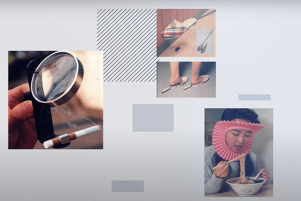
If you don’t empathize, then you commit a grave error. There’s actually a Japanese term for this kind of invention — chindōgu — which was created by a Japanese artist in the 1990s. Look closely at each of these inventions (below). If you had a problem and you bought one of these inventions, you’d have two problems. If you can’t empathize with your user, you’re liable to create something that doesn’t solve a problem and creates new problems. Often, when founders fail, they don’t focus on solving other people’s problems; they focus on solving their own problem — the problem of needing a problem to solve for their startup. Don’t be that founder; you’re creating more problems for the world. Feel the pain your users have, give them a better way, and you will find the path forward.
Illuminate the path
The third step to designing anything is to know that it is up to you to illuminate the path for your users. You have to be opinionated and light the path so that users know where they are and how they can get to where they want to go. And the primary way you do this is in the text, the type of language you use. Here’s a bad example of it:

It’s a passive voice. It doesn’t speak directly to the reader; it doesn’t show. The unfortunate thing is [that] this type of writing shows up everywhere, and it’s a lost opportunity.
Look at this (below) in contrast. Notice how the eye is drawn to specific things on the page. The text is you talking to the user directly.

A bad salesperson doesn’t make eye contact and makes a vague conversation about something tangentially related to what you’re there for. A great salesperson looks you in the eye and sees what you want and says, “Come this way.” That’s what you need to do in these designs.

I recently saw this great graphic (above) created by a founder named Harry Dry on the “Trends” Facebook group, and I think it really hammers home exactly what I mean by direct command language. In a conversation, you have the benefit of back and forth; on a website or mobile UI, you have no such thing. So it’s a great exercise when you’re designing your UI and you’re in user simulator mode [to] try and think through what a user might be doing and thinking. If you ask yourself, “What is the one top objection someone might have to a call to action button?” you’ll find that you can turn a no into yes. If a button says “Start free,” you might expect that they’re going to ask for a credit card, but if the button says it doesn’t, that immediately lowers the barrier and makes me want to proceed. Be direct; use a number or action verb; and be concise. Tell the user what they should do and why. Illuminate the path, and if you can do that, you’re already better than 99% of other people trying to do design.
Minimize the non-essential
Next, you’ve got to minimize what you put on the page. The key principle here is: use only what you need. Edward Tufte is one of my favorite pioneers of information design. He talks about this useful concept called chartjunk; its markings and visual elements that are not part of the minimum set of visuals necessary to communicate information understandably. Here’s an example. A lot of people think of design as picking colors and style, but as Steve Jobs said, ”Design is actually how it works not how it looks.” Chartjunk-like graphic choices are the number one thing I use to tell if something is poorly designed or done by true amateurs.
For every color, line or pattern, I want to know there was a reason and intention for it. Let’s look at this example:

All of the stuff on the page [above] — that’s chartjunk. Look at that graph. Why a green background? What does that pattern mean? Why red for the bars? Its noise and aesthetic choice that signifies nothing. For the map on the right, is there any reason why there’s a radial gradient? Why those colors? If it doesn’t mean anything, it’s junk. So if that’s chartjunk, how do we avoid it? Here’s the simple principle: if it can be removed without taking away any meaning, remove it.
“The evolution of culture marches with the elimination of ornament from useful objects.”
Adolf Loos, Architect
Ornament is not signal; as Tufte notes, it’s junk.
Here’s another example of minimization. Colons are stupid. Why even have them? Notice if you remove it, there’s no change in the design content at all. It’s subtle, but when you do this across your whole product, it adds up to an unobtrusive and clean design.
Create something great
Finally, you’ve got to create, and the best way to do that is be very, very crisp about contrast. Contrast is how you as a designer confer to the user what is important. Notice how obvious it is, what your eye is drawn to in this.
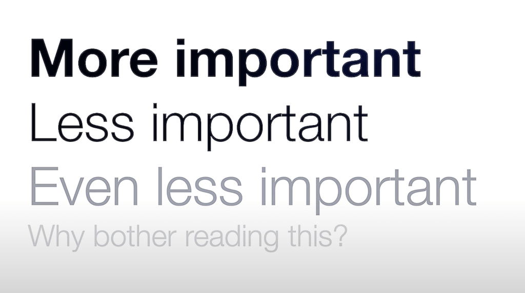
But then look at what happens when I make it all the same contrast; the differences disappear, and they become equal. This leads us to something every one of you should try to remember very clearly: if everything is bold, nothing is bold.

“Ah,” you say. “Well, what about color?” Color absolutely drives a lot of attention. Again, contrast is king.
Let me share with you one more useful tool that you can put in your tool belt, and that’s the “Squint Test.” When contrast is not obvious just by looking at it, squinting at a page allows you to see what you are emphasizing. The details fade away, and the blobs that really jump out at you are what you specifically are instructing the user to pay attention to.
After contrast, the next most important design concept you need to know is closeness. You want related concepts together. I can’t tell you how often it is that I find mistakes like this (Version 1) in amateur designs, and here’s the pairing that actually makes sense (Version 2, below).


Closeness is so important that one level of organization up from that is actually a grid, a systematic way to organize any layout.
Here’s one from the original Bootstrap CSS that shows how contrast and closeness combine to create a visual hierarchy. Notice how the headers are so prominent [that] they allow for really quick scanning, and scanning headers in a visual hierarchy allows the user to drill down to the body text quickly and find the thing that they were looking for.

Here’s another example of no hierarchy. In this example, the text in the middle is drawing way more attention when I probably should be paying attention to the top part. Without visual hierarchy, the user gets confused and can’t tell what they should be looking at. Remember you’ve got to illuminate the path — without visual hierarchy, the user is lost.

If you want some concrete layout rules, here’s my simple advice: remember contrast is how you determine what is important; group related items; and first use padding or margin to give separation. Next, you can use a grid to put related items next to each other. As you add more content or functionality as needed, you might need more ways to separate or nest concepts, and you can use a line for some of that. And if all else fails — and you must — a box is your friend. The funniest thing is [that] I learned all of these things in high school newspaper. Luckily, you don’t have to go back to the tyranny of my California public school education to learn the things we just talked about today.
So that’s it. I’ve taught you in as few concepts as possible the bare minimum of what you need to be able to start your design journey. First, delabel yourself — know that you don’t need a permission slip or stamp on the forehead to do design. Then, empathize with others — if you can walk a mile in the shoes of your users, you’ll understand their wants, needs and motivations, and you’ll be able to make their lives better. Third, illuminate what’s important — be opinionated, and have a firm handshake; show the path forward, and your users will be happy instead of frustrated. Next, minimize what’s not important. Get rid of ornamentation so that the things that truly matter can rise to the highest levels of attention. And finally, create. Create great UI; create great layouts. Use contrast closeness and grids to translate how it works or interaction design into a visual design that supports your goals. Being a designer isn’t anything fancy. It’s, if anything, just applying simple proven principles to your life and your work.
Thanks for reading! To watch my full episodes that go into detail about these ideas — and more — head over to my YouTube channel.